Role
UX Designer (Team of 4)
Key contributions
Customer Journey Mapping · User Physical Prototyping · User Testing
Duration
7 weeks
Team
Kevin Lum · Aishah · Nurdiyanah · Me
Tools
Figma
01 · Snapshot
Parents travelling on Singapore's public buses with young children face safety and comfort challenges during the journey, yet bus interiors are not designed with their needs in mind.
The outcome
We evaluated two solutions, a retrofittable booster seat and three interior colour schemes, with eight parents and their children. Both were well received, with the rear-facing booster seat emerging as a clear favourite.
02 · The problem
For many Singaporeans, taking the bus is part of everyday life. For parents travelling with young children, however, the journey often comes with added challenges, from finding a safe place to sit and managing a stroller to calming an upset child in a crowded public space. Our goal was to understand these pain points and design a solution that made bus journeys safer, smoother, and less stressful for both parents and children.
03 · What we did
Research
As a team, we conducted observational studies and created an empathy map (Say / Think / Do / Feel) to better understand the experience of parents travelling with young children on public buses. We uncovered several recurring insights: commuters viewed bus journeys as downtime, strollers often had to be folded when wheelchair spaces were occupied, children frequently stood on seats to look out of the window, and parents felt anxious about disturbing other passengers when their child meltdown.
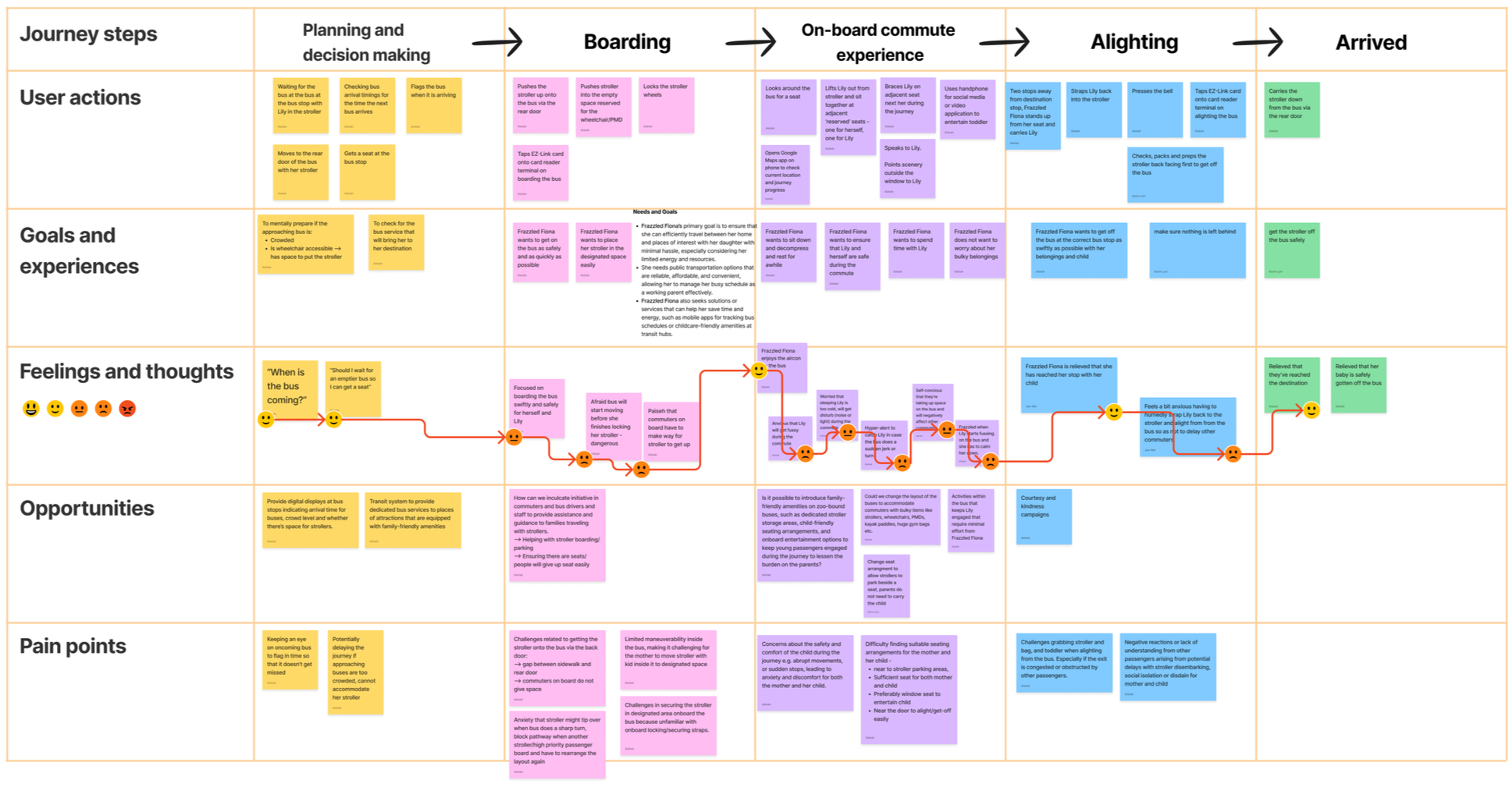
We synthesised these findings into our persona, Frazzled Fiona, a first-time mum travelling with her two-year-old. I then created the customer journey map, translating our research into five key pain points spanning the journey, from the stress of boarding to remaining constantly alert for sudden bus movements.
Ideation
As a team, we generated ten "How Might We" statements before using dot voting to prioritise the 5 strongest opportunities.

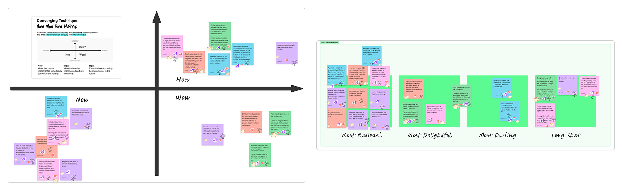
We then brainstormed 10 ideas for each statement, generating 50 concepts in total. Through another round of dot voting, we shortlisted three ideas from each brainstorming board, leaving 15 concepts that resonated most with the team. We then applied the Now-How-Wow Matrix and the Four Categories method to further refine them into five concepts for prototyping:
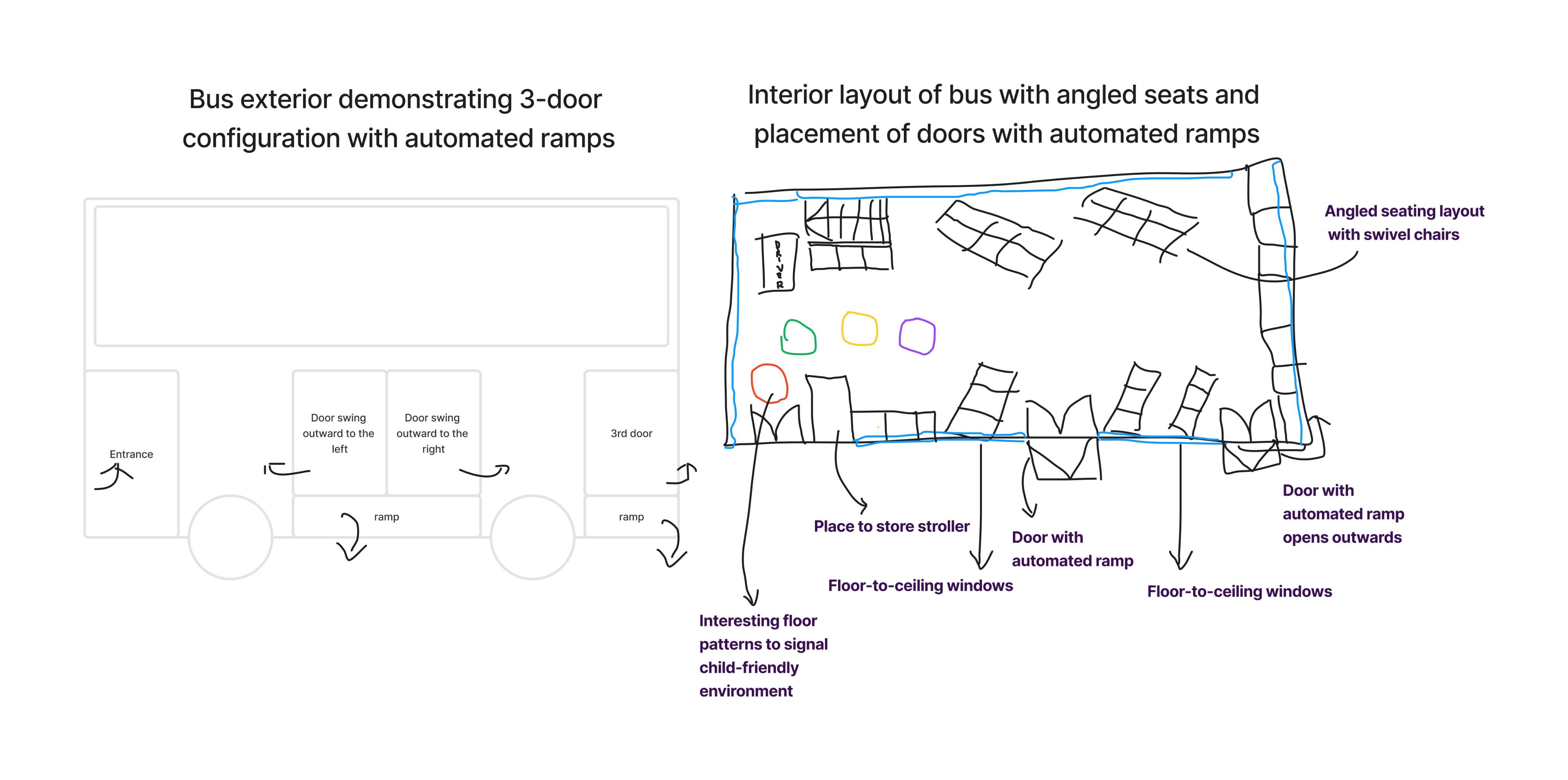
Automatic boarding ramp
Angled or swivel seating
Seat armrests
Lower or floor-to-ceiling windows
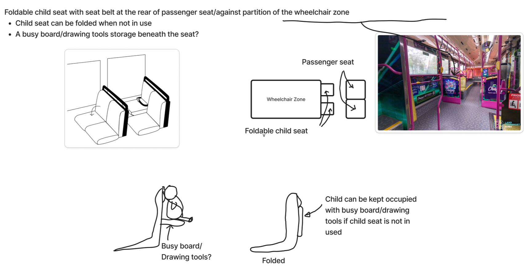
In-seat activity boards
Realigning the problem
While developing our concepts, we discovered that the Land Transport Authority (LTA) had previously trialled automated wheelchair ramps with SBS Transit between 2017 and 2018. The trial found that the ramps increased boarding times and maintenance requirements, making the solution impractical.
Rather than pursue an idea that had already proven unviable, we decided to narrow our scope. With a seven-week timeline, we shifted our focus away from boarding and alighting to the journey itself, reframing our challenge as:
"How might we design the bus commute experience to be safe and welcoming for parents traveling with their young children?"
Prototyping
We developed two complementary solutions.
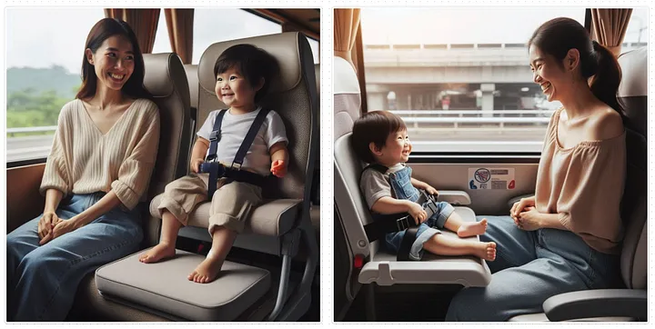
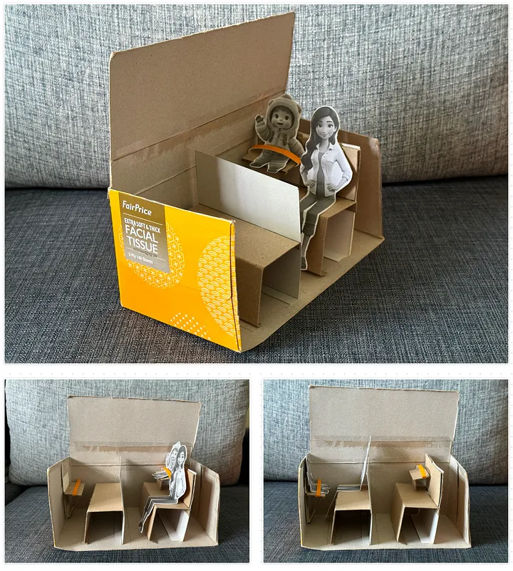
The first was a retrofittable booster seat module featuring a safety harness, adjustable armrests and seat height, waterproof padding, and a fold-up mechanism to save space when not in use. We explored two seating configurations: side-by-side and rear-facing. I built a cardboard prototype to demonstrate the folding mechanism, using cardboard strip to simulate the seat harness, while another team member used Microsoft Designer to create concept renders.
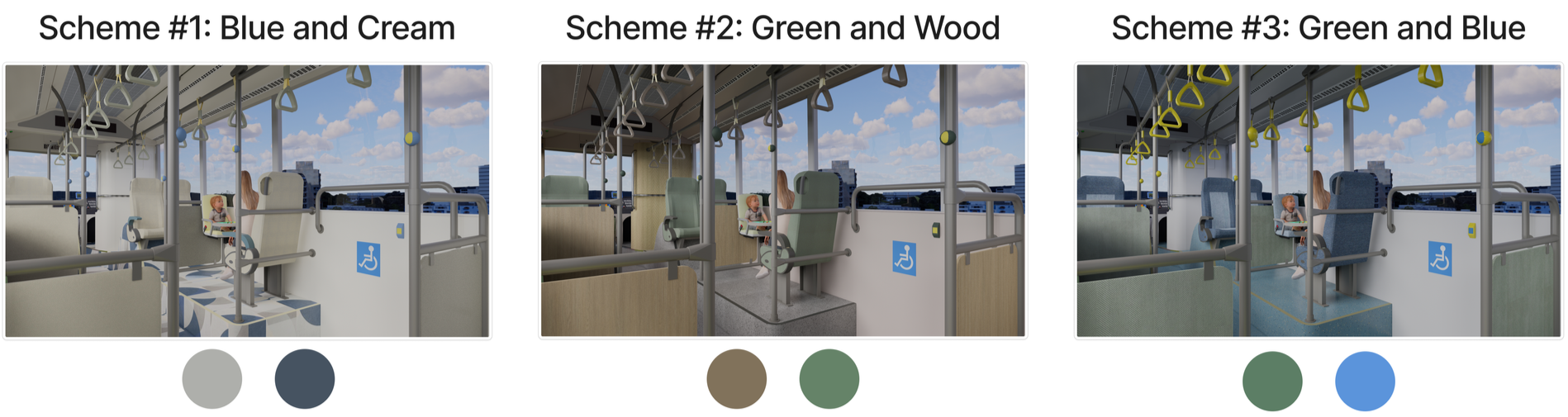
The second solution explored how colour psychology could create a more welcoming environment for families. After researching colour theory, we produced three interior concepts in SketchUp, varying the seating, flooring, and interior panelling.
Validation
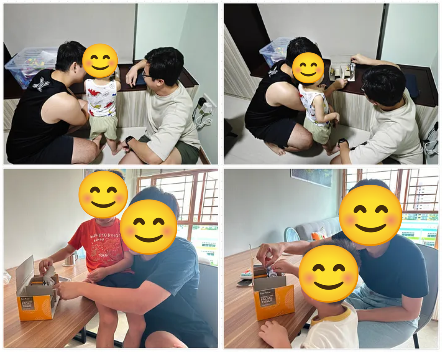
We evaluated our concepts with eight parents and their children, aged 2–5, focusing on three questions:
Which booster seat configuration felt most comfortable?
What was the ideal booster seat height?
Which interior colour scheme felt most welcoming?
I facilitated two of the eight sessions with parents I recruited, testing both the cardboard booster seat prototype and the interior colour concepts.
04 · The result
This was a module project rather than a shipped product, so the findings below are based on usability testing rather than live usage data.
What testers preferred
The rear-facing booster seat emerged as the clear favourite. Parents said the face-to-face configuration made it easier to monitor, comfort, and interact with their child during the journey. As one participant explained:
"I think the facing one is easier because you're seeing your child face to face, so it is easy to manage."
Parents also consistently preferred the booster seat at its highest setting, as it allowed children to look out of the window without kneeling or standing on the seat while providing more legroom for the accompanying adult.
Colour response
All three interior colour schemes received positive feedback. Participants most frequently described them as "calming" and "modern," aligning with the intended design direction.
One key takeaway
During our post-test discussions, every parent told us they felt their experiences had been understood and reflected in the concepts. Although the project didn't reach an engineering-ready solution, this gave us confidence that we had accurately identified the problems that mattered most to our users.
05 · Reflection
Creating the customer journey map proved to be one of the most valuable contributions I made to the project. By translating our empathy mapping into five concrete pain points across Fiona's commute, it gave the team a shared understanding of where parents experienced the most friction. When our original boarding-ramp concept became unviable, this work helped us quickly realign around improving the in-commute experience instead.
Facilitating the cardboard prototype sessions also reinforced the value of testing with physical artefacts. Watching parents place the prototype into different seating configurations revealed preferences more quickly, and often more naturally, than simply asking them to describe what they wanted.
If I were to continue this project, my next step would be to test with a larger and more diverse group of parents. Our sample of eight participants provided useful directional insights, but it was relatively small and largely recruited through our personal networks.