Role
UX/UI designer
Duration
12 weeks
Platform
Web, desktop and mobile
Team
1 Project Director,
1 Developer and Me
Tools
Adobe XD
01 · Snapshot
Recruiters at FindSGJobs' outdoor career booths had no easy way to match jobseekers with nearby opportunities. They had to switch between the job portal and Google Maps just to check the location of a single job.
The outcome
Previous workflow
~30s
per job location check
Jobs Nearby
~20s
to view every matching job
The feature was later adopted by Jobs Anywhere @ North West, a community employment initiative by North West CDC, powered by the FindSGJobs platform.
02 · The problem
Recruiters spent about 30 seconds checking the location of each job, copying the address into Google Maps, switching back to the portal, and repeating the process for every listing until they found a suitable match or exhausted the results.
The repeated back and forth slowed the conversation and reduced the time recruiters could spend helping jobseekers.
03 · What I did
Research
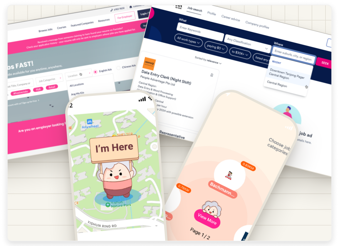
I audited three local job portals, FindJobs, FastJobs, and JobStreet, to understand how each supported location-based job search.
1
FindJobs
Displayed approximate distance, but required opening each listing to view it on a map.
2
FastJobs
Filtered by town and nearest MRT station, a general sense of location rather than actual proximity.
3
JobStreet
Filtered by town or region only, so nearby opportunities could still be buried among less relevant listings.
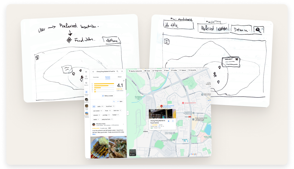
I then benchmarked Google Maps because recruiters were already relying on it at career booths. Rather than introducing a new interaction pattern, I wanted to build on an interface they already understood.
Key insights
Recruiters weren't struggling to use our search function, instead they were leaving our portal to complete their task in Google Maps. The real issue wasn't the quality of our filters. It was that recruiters had to rely on two separate tools to complete a single workflow. This shifted the design challenge from improving search to integrating location directly into the job discovery experience.
Ideation
Instead of redesigning the search filters, I focused on eliminating the need to switch between FindSGJobs and Google Maps. To make the experience intuitive, I applied Jakob's Law: users spend most of their time using other products and therefore expect familiar interaction patterns.
Design
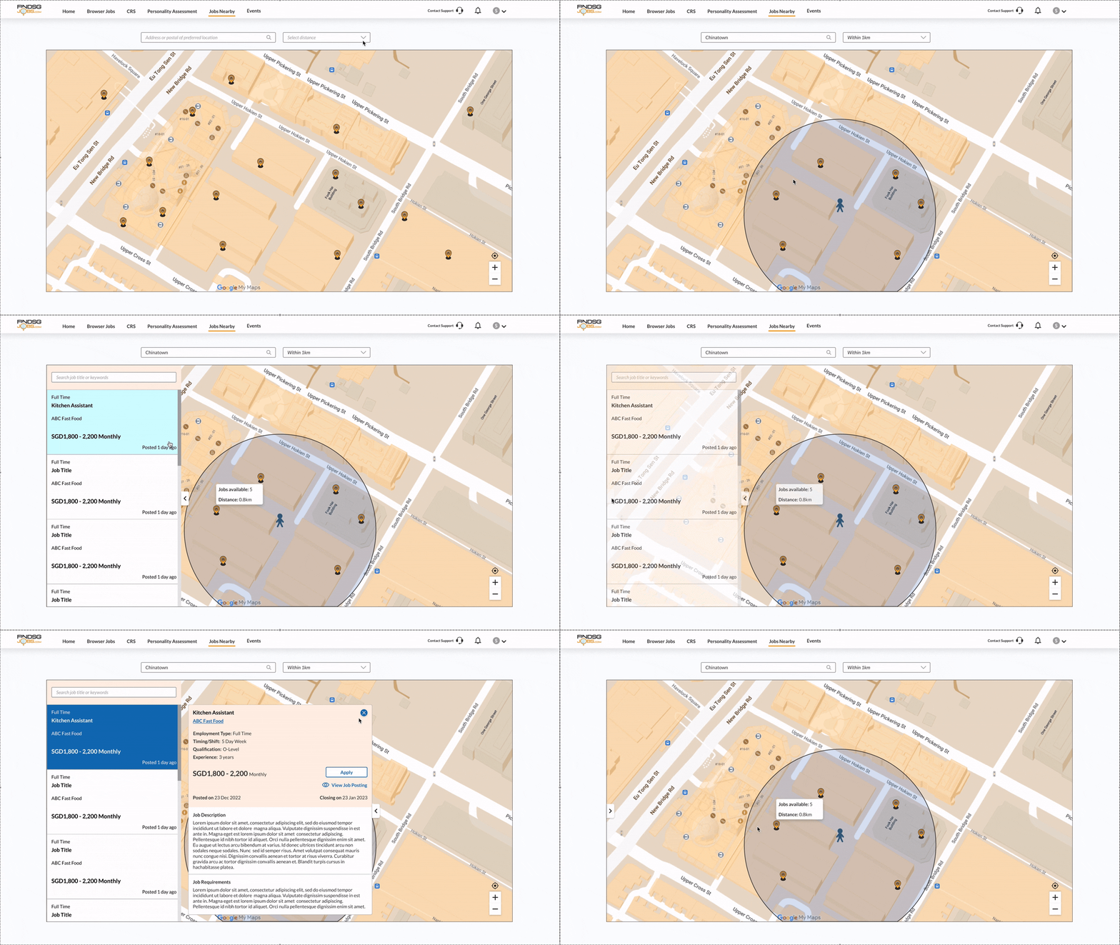
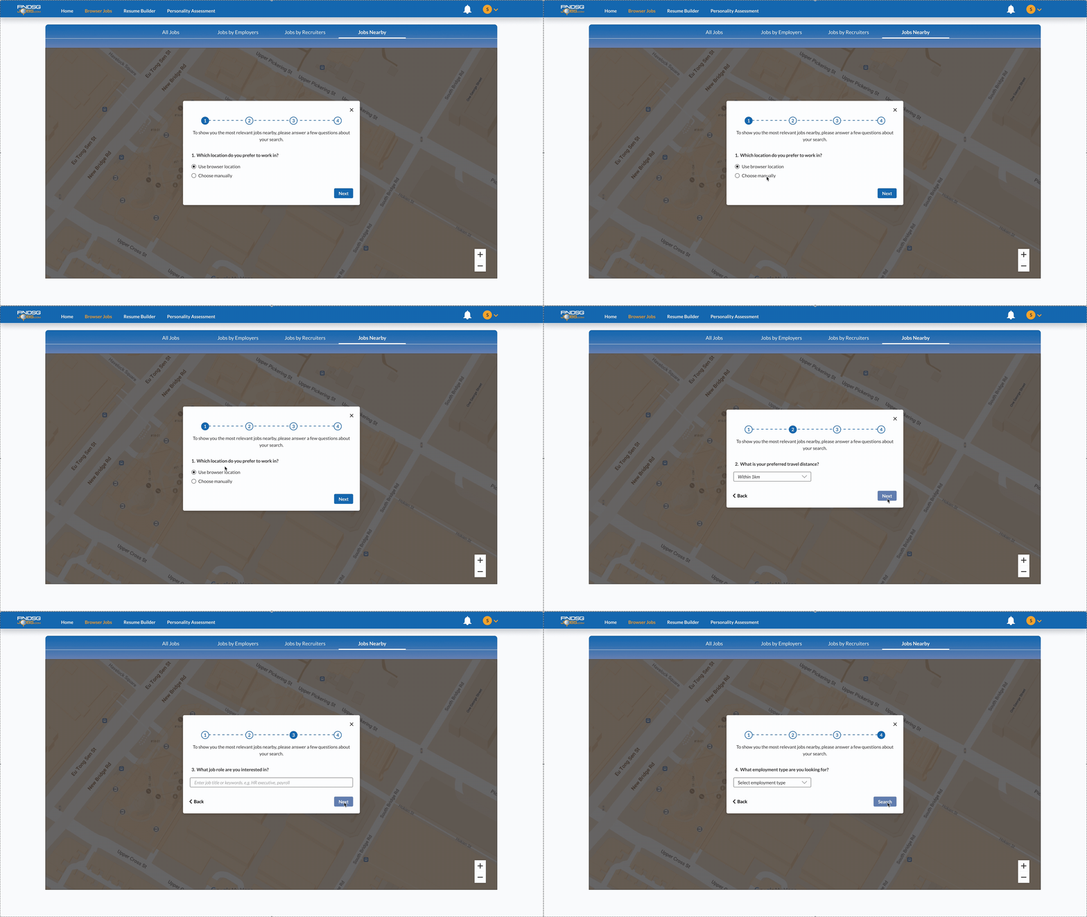
Users could set their search location using GPS or by entering an address, then select a search radius between 1 km and 5 km. Jobs matching the criteria appeared directly on an interactive map, with markers showing the number of available roles and their approximate distance. The radius was capped at 5 km on purpose, to keep results genuinely close rather than overwhelming. The feature was also built mobile-responsive.
Validation
Due to project constraints, I did not conduct a formal usability study. Instead, I worked closely with the Project Director and developer to review the design during implementation. This surfaced two issues:
Initial map loading exceeded 5 seconds.
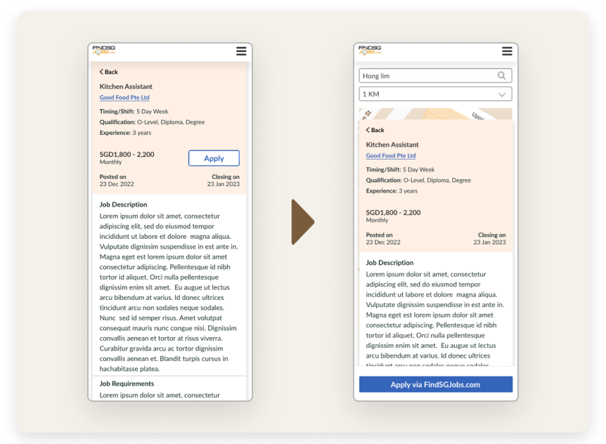
Apply button was too small on mobile.
To improve performance, I redesigned the experience into a step-by-step flow where jobs are loaded only after a search radius is selected, rather than loading every job location upfront. During a later revamp of the FindSGJobs portal, we also introduced a Get Directions function, which opens Google Maps with the route prepared, removing the need to manually copy and paste job addresses.
04 · The result
As I didn't have access to post-launch analytics, I measured the feature's impact through workflow comparison and real-world adoption.
Faster workflow
Previous workflow
~30s
per job location check
Jobs Nearby
~20s
to view every matching job at once
Real-world adoption
Originally designed for FindSGJobs, Jobs Nearby was later adopted by Jobs Anywhere @ North West, a community employment initiative by North West CDC, powered by the FindSGJobs platform.
05 · Reflection
With more time and access to user data, I would want to validate whether the step-by-step search flow genuinely improved the experience, rather than simply confirming that it resolved the loading issue.
The biggest lesson from this project was recognizing that a technical problem was actually a design problem. Instead of asking how to make a slow-loading map faster, I questioned why the map needed to load every job in the first place. Reframing the problem led to a simpler solution that improved performance without compromising the experience.